

224: USA Real Estate Crash Maps - boom, bust, foreclosures, negative equity risk, population, poverty, subprime foreclosure, happiness, income....
09-14-2008
PropertyInvesting.net team
We thought our US visitors would probably appreciate viewing the real estate price maps available for your analysis of which areas, regions and suburb are suffering the most and which areas may survive better than most in the current market downturn. We hope you are be able to absorb this data per State to judge whether are particlar area is at risk or not. We hope you find these maps helpful to build into your real estate investment strategies.
Foreclosure Rate Map USA
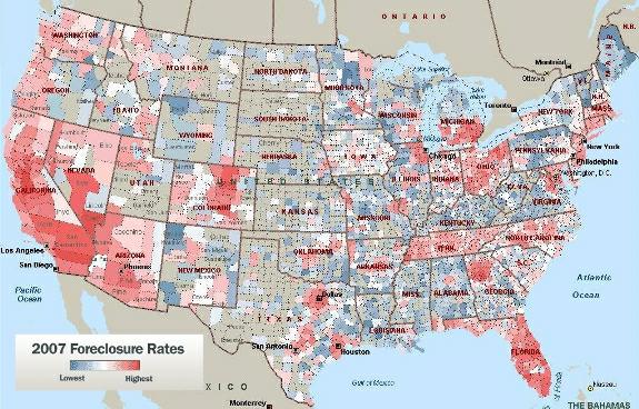
Foreclosure heat map USA
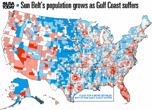
Population Growth Map in USA - sunbelts and coastal areas increase, rural inland areas tend to decrease
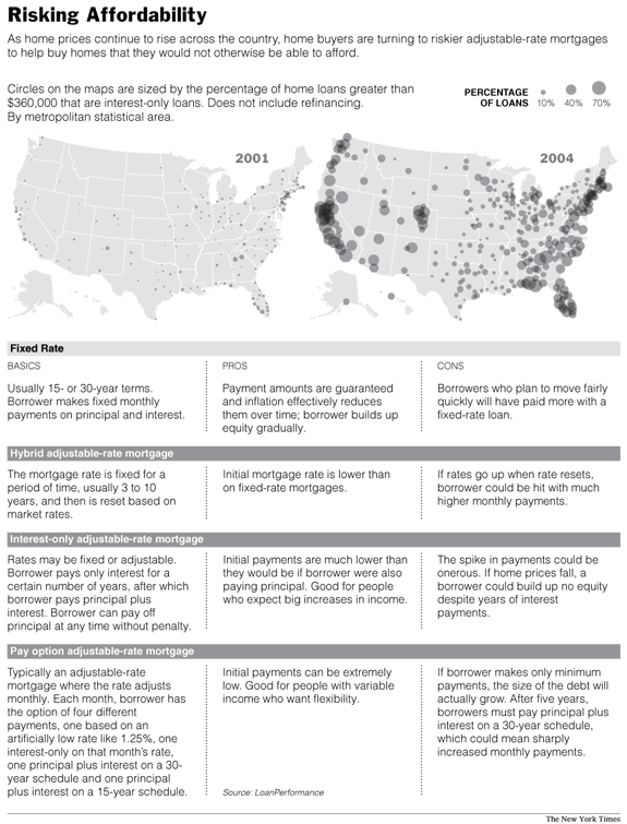
Risking Affordability Map USA (2001 compared to 2004)
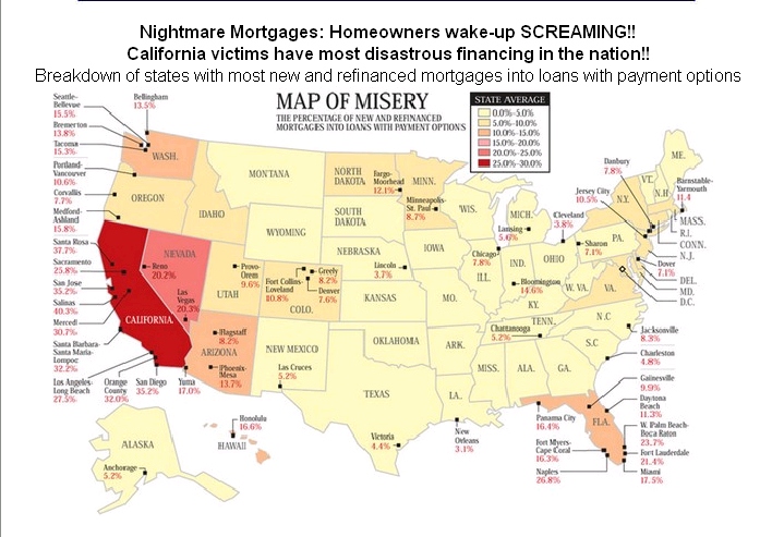
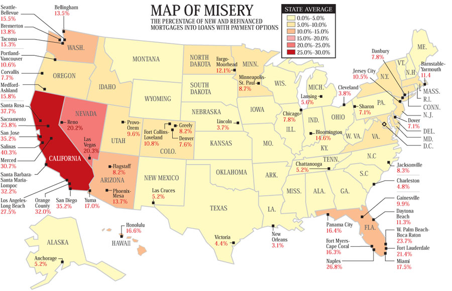
Mortgage Nightmare Misery Map USA - percentage with most refinanced mortgages
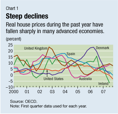
US House Prices Growth Graph Compared to other developed countries
Mortgage Misery Map USA - percentage in misery
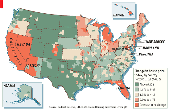
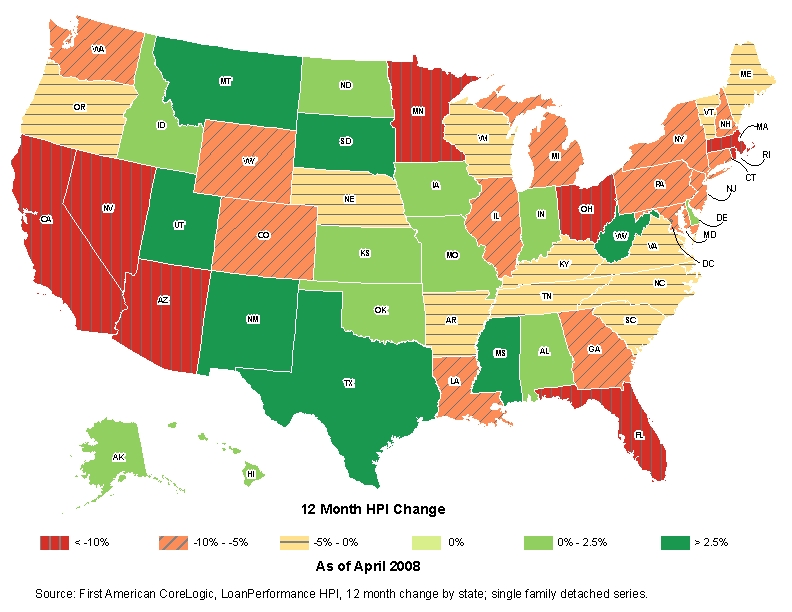
US House Price Index Change HPI year up to April 2008
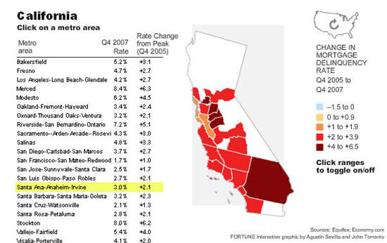
California Mortage Meltdown Map - change in mortgage delinquency
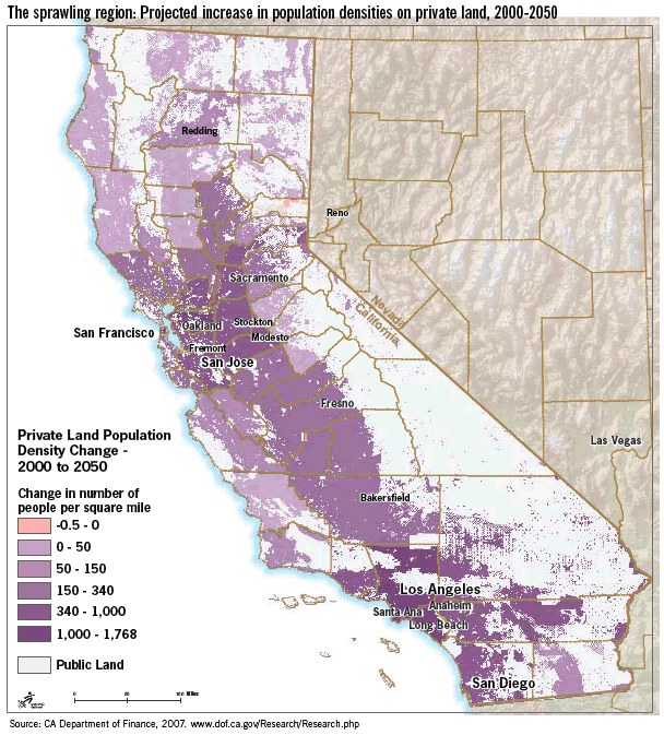
Population Growth Map California
Population Density Map USA - blue most dense, white/yellow least dense
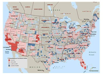
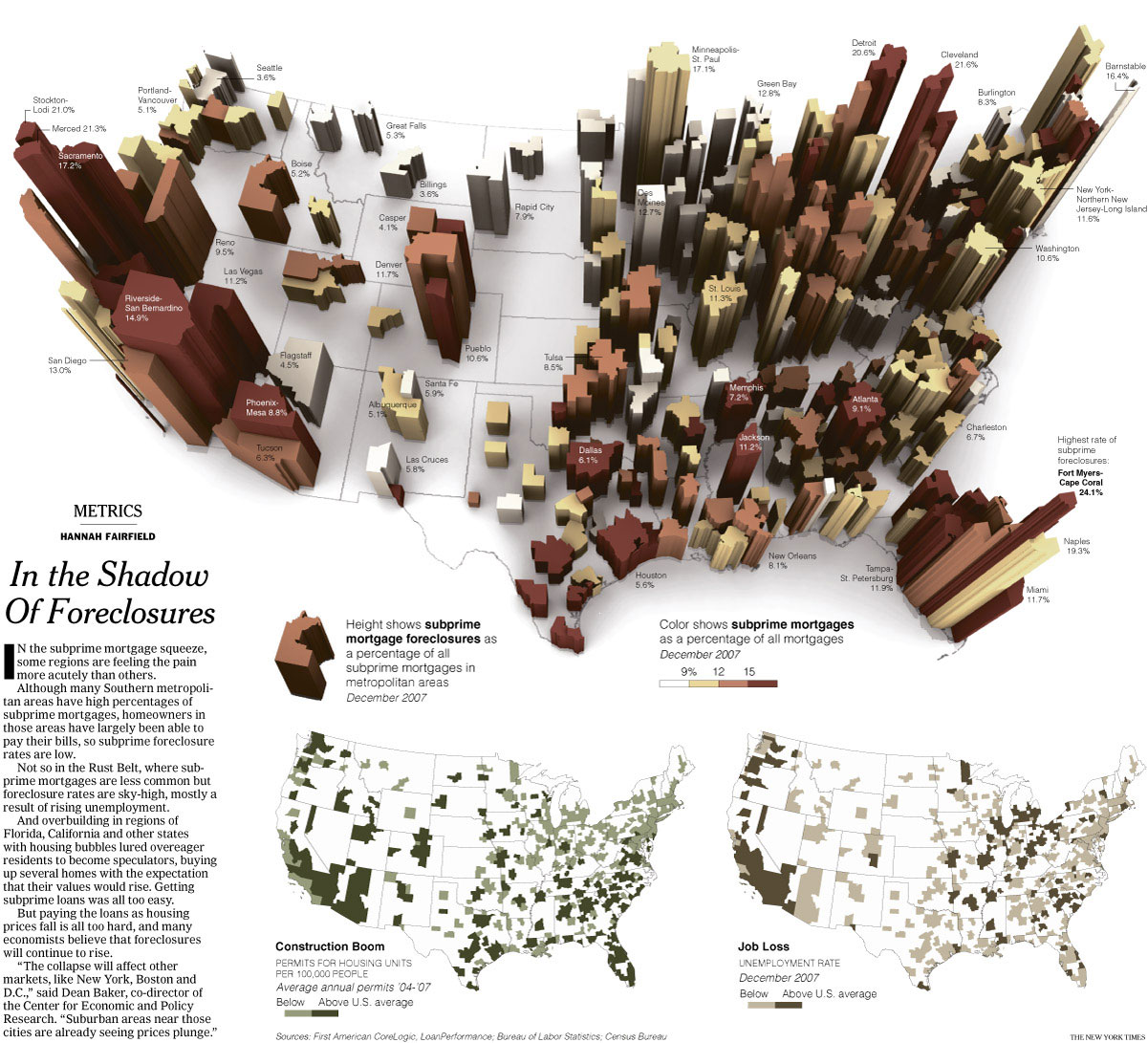
Subprime Mortgage Foreclosures Map in USA Per State
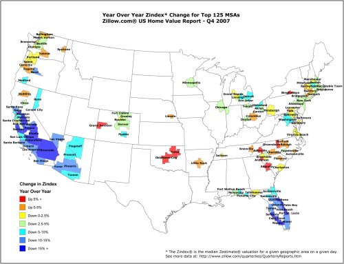
Zindex US Home Value Report Map Q4 2007
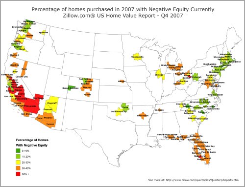
Negative Equity Map Q4 2007 from properties bought in 2007 in USA
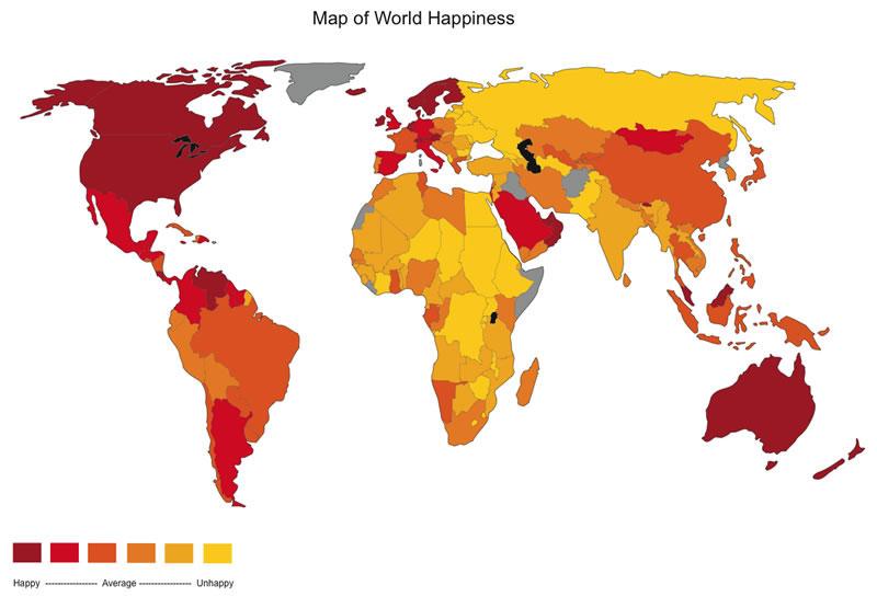
Map of World Happiness - USA scores high
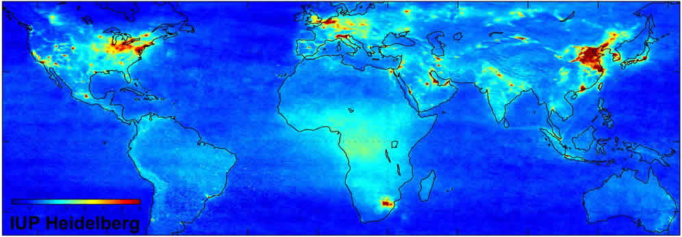
Global Pollution Map (red areas are highest pollution centers)
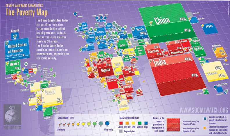
Worldwide Poverty Map
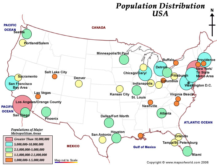
US Population Distribution of major cities
s
World Poverty Map - with USA in comparison
s
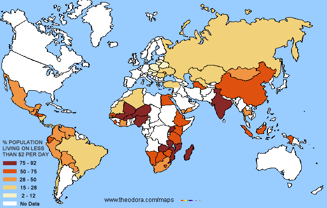
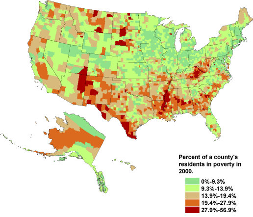
Poverty Map as Percentage of USA 2000
d
Poverty Map USA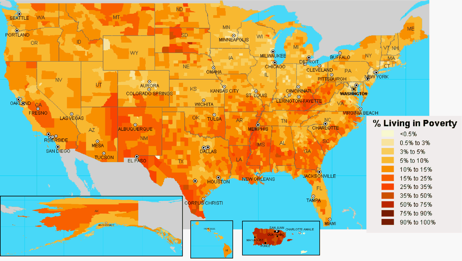
w
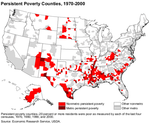
Persistent Poverty Map - Counties in USA
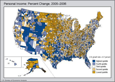
Personal Income Map USA - Percentage Change 2005-2006
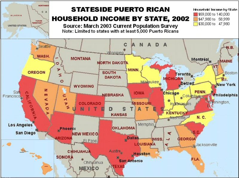
US Income Map (from March 2003)
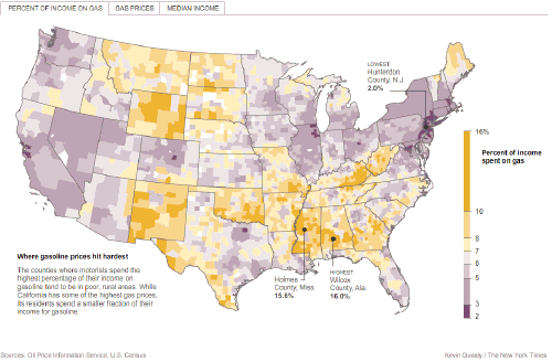
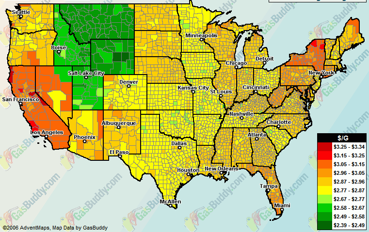
Gas Price
Map as Percentage of Income - who's income is being hit the most?
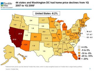
Freddie Mac House Price Declines Map - year up to Q1 2008
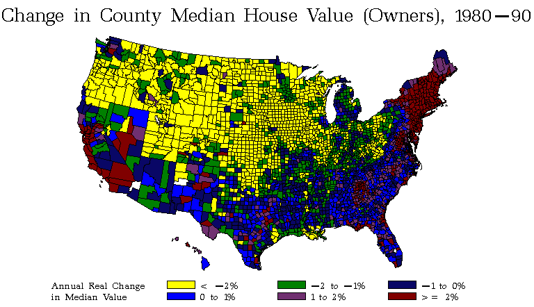
Median House Value Change Map 1980-1990
Home Loan House Price Index Performance Heat Map
Gas Price Map USA
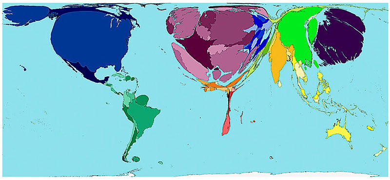
World House Price Asset Value Map - described by area - note how large the UK (popultion 60 million) is compared with USA (popultion 300 million) and geographic areas of the world. Note how small most of Afria is.
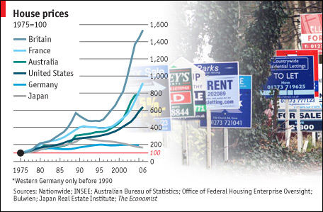
House Price Boom Graph - USA, France, UK and other countries - www.economist.com
For USA investors, note the US has not seen such real estate price rises like the UK and France. This graph would indicate prices will eventually recover as long as popultion growth and GDP continue to rise in the USA - as expected.
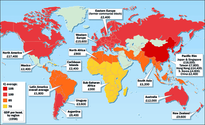
IQ Map of the World - for your interest - frankly we're not sure whether this map has any merits but its of interest all the same. It compares incomes versus IQ. In theory, the higher the income, the better the education and the higher the IQ (and higher the house prices). This is going a bit far we admit, but education is a key factor in both incomes/business and hence house prices.
US IQ is high as is the income - possibly related to USA having one of the highest levels of College Education (to 21 years old) than any country in the world.
One interesting observation though is that China has a relatively low income but the highest IQ - so expect house prices in China too shoot up in the next 20 years as the country industrialises - the improving eduation, hard work and new business will benefit the country hugely.
Subway New York
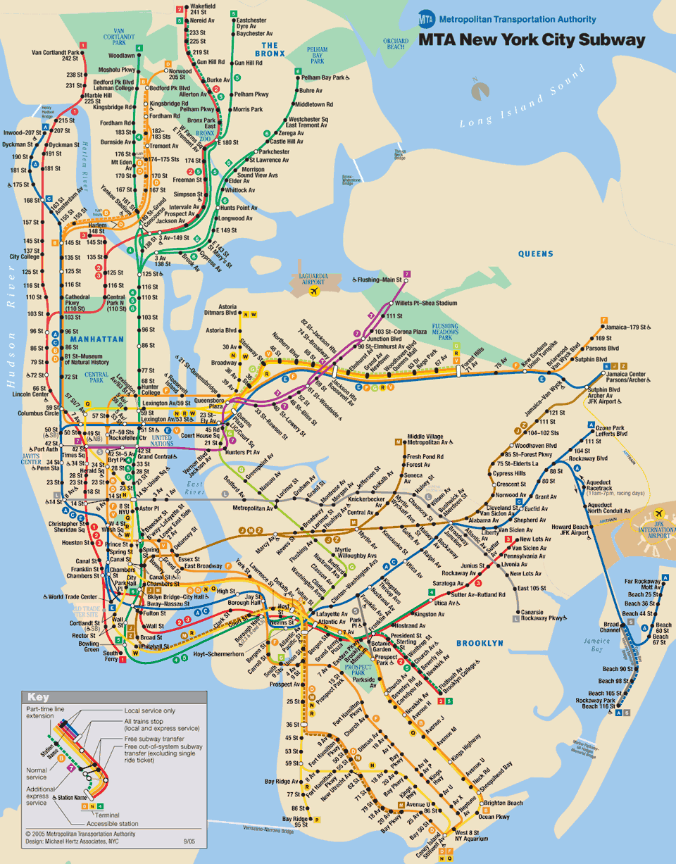
Map
Subway New York
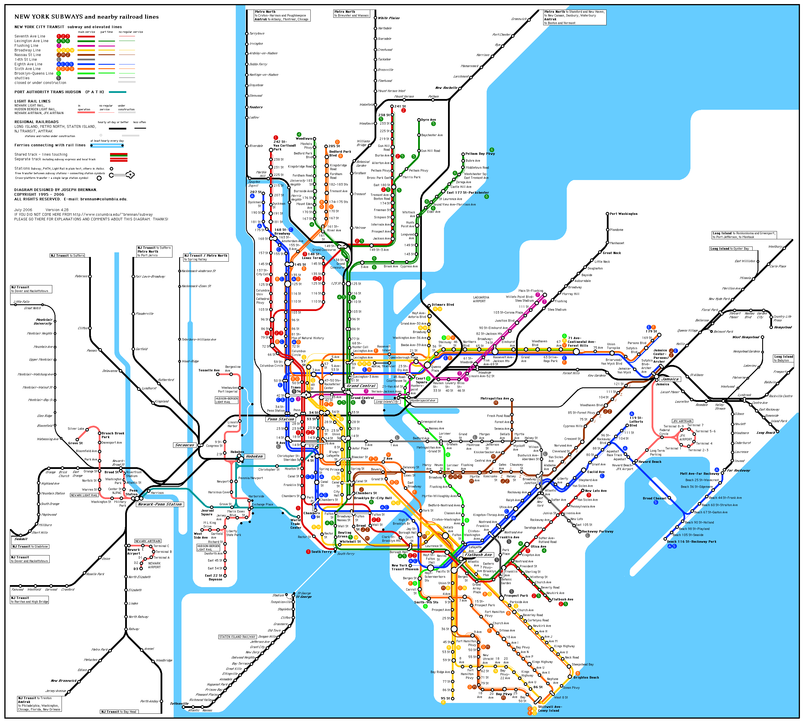
Map
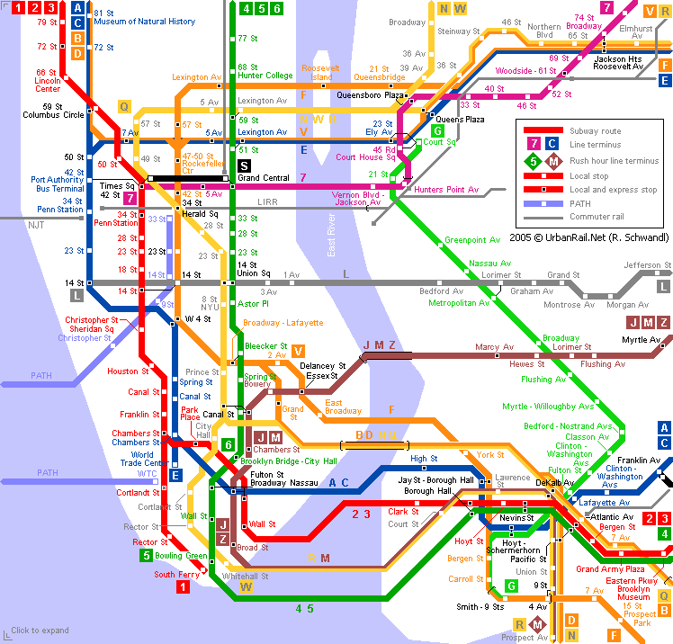
Urban Rail Map New York
USA
We hope you have found these maps and insights helfpul for your real estate investing strategies. if you have any comments or suggestions, please contact us on enquiries@propertyinvesting.net
www.google.com www.images.google.com